


The Brief
Ramen Wave is a concept ramen bar — a certification-practice project built to the same standard as a paying client brief: full identity, menu, and packaging, not just a logo exercise.
The Challenge
Most ramen and Asian-fusion brands reach for the same visual shorthand — red and gold, dragons, chopstick icons, a katakana-style font. It reads as generic before it reads as food. Ramen Wave needed an identity that felt specific to one restaurant, not to the category.
My Approach
I started from the name, not the cuisine. "Wave" gave me a literal motif — a line that could double as a noodle — instead of borrowing symbols from Japanese visual culture that weren't mine to use. From there, the mascot came first and the rest of the system was built to carry it: if the goose chef could work on a business card and on the side of a takeout box at the same size logic, the system would hold.

Identity System
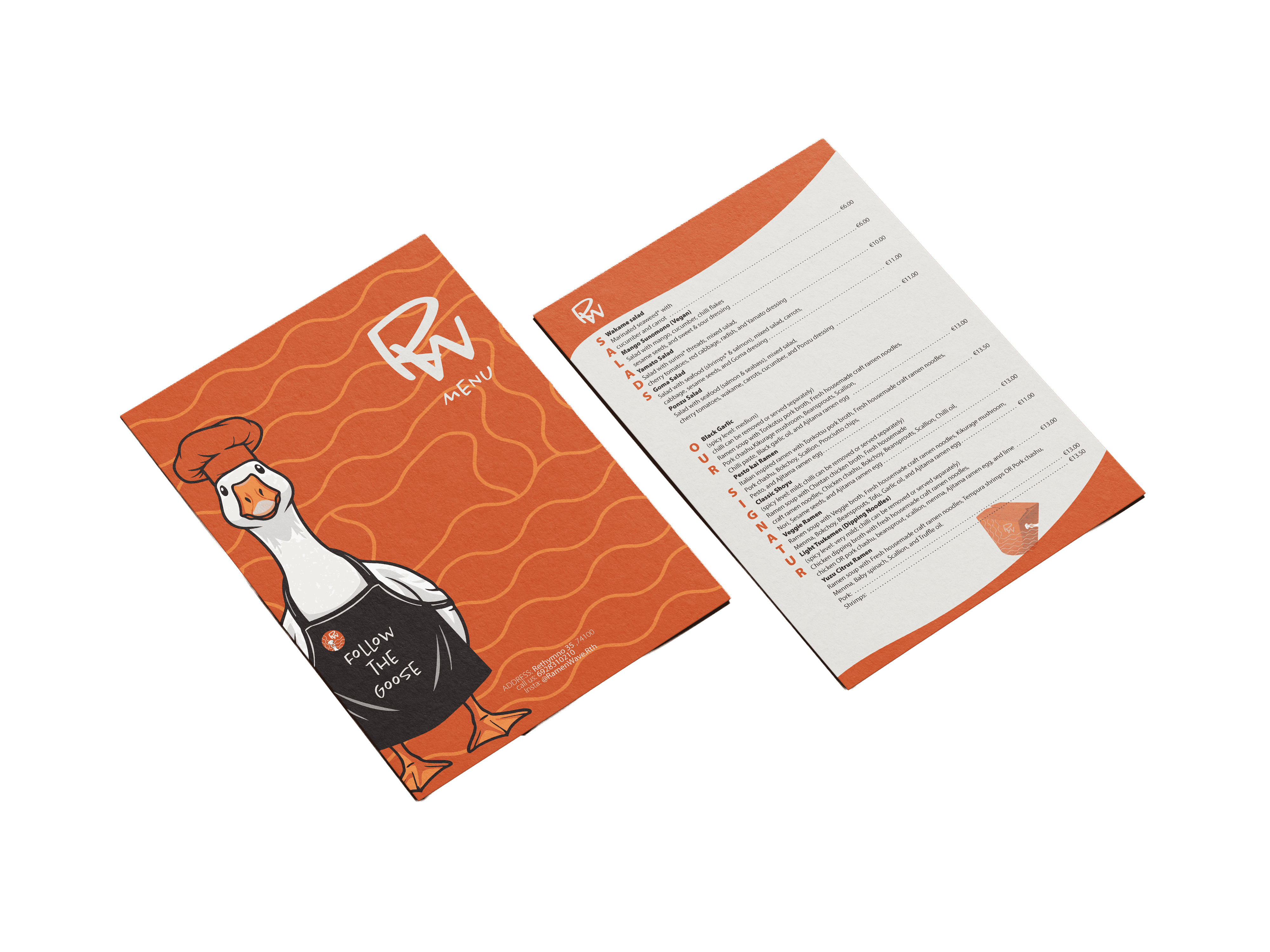
The mark is Follow the Goose — a white goose in a chef's coat and apron, playful enough to be memorable, specific enough that no other ramen bar could claim it. Next to it, a hand-drawn "RW" monogram keeps the identity from feeling too illustrated or too corporate — it reads as a signature, not a crest. The wave line runs through every surface as the connective tissue between the two: menu background, packaging, app icon badge.

Packaging
The take-out box carries the identity the same way the menu does — no separate packaging language, just the same system scaled down. The wave pattern wraps the sides, the "RW" monogram sits on the front panel, and the mascot's hand reaches into frame as if it's the one packing the order. Warm terracotta with a light kraft-paper grain keeps it feeling like part of the same restaurant, not a separate product line.

Typography System
The wordmark and the mascot's voice ("Follow the GOOSE") run in Chantal Light — a loose, hand-lettered script that gives the brand its handmade warmth instead of a stiff corporate feel. Menu copy, dish descriptions, and pricing switch to Myriad Pro for clean legibility at small sizes, with the category labels (SALADS, OUR SIGNATURE) set vertically in brand orange as a wayfinding device down the page edge.
Outcome
A complete identity carried across every touchpoint a guest would actually see — logo, mascot, a two-panel A5 menu, and takeout packaging — built as one system rather than four disconnected pieces. The same mascot, monogram, and wave motif repeat from the menu to the box, so the brand holds together end to end.
Project type
Brand Identity & Packaging
Company name
Ramen Wave
Industry
Food & Drink — Ramen bar

