


The Brief
Tea Bliss started as a concept brief from my design course, which I built out into a full commercial identity. The idea: a plant-based tea shop with zero chemical preservatives, aimed at people in their twenties and thirties who actually read labels before they buy. First and foremost a physical store — cups, counter service, take-away packaging — with select supermarkets and delicatessens carrying the retail line as a second, smaller channel.
The Challenge
Tea and wellness drinks live in a crowded, visually similar space — most competitors lean on the same green-and-kraft-paper shorthand for "natural." The challenge was building an identity that works first as a walk-in shop experience — signage, cups, a counter someone actually stands in front of — and then translates cleanly onto a supermarket or deli shelf without becoming a different brand once it leaves the store.
My Approach
I started from the in-store experience itself — the cup someone carries out the door, the sign above the entrance — and built outward from there. A shared leaf mark, doubling as a rising steam trail, anchors every version, from the shopfront sign to the five flavour lines. Once the in-store identity held together, I extended the same system into packaging built for supermarket and delicatessen shelves, so the product reads as the same shop even outside its own four walls.
Identity System
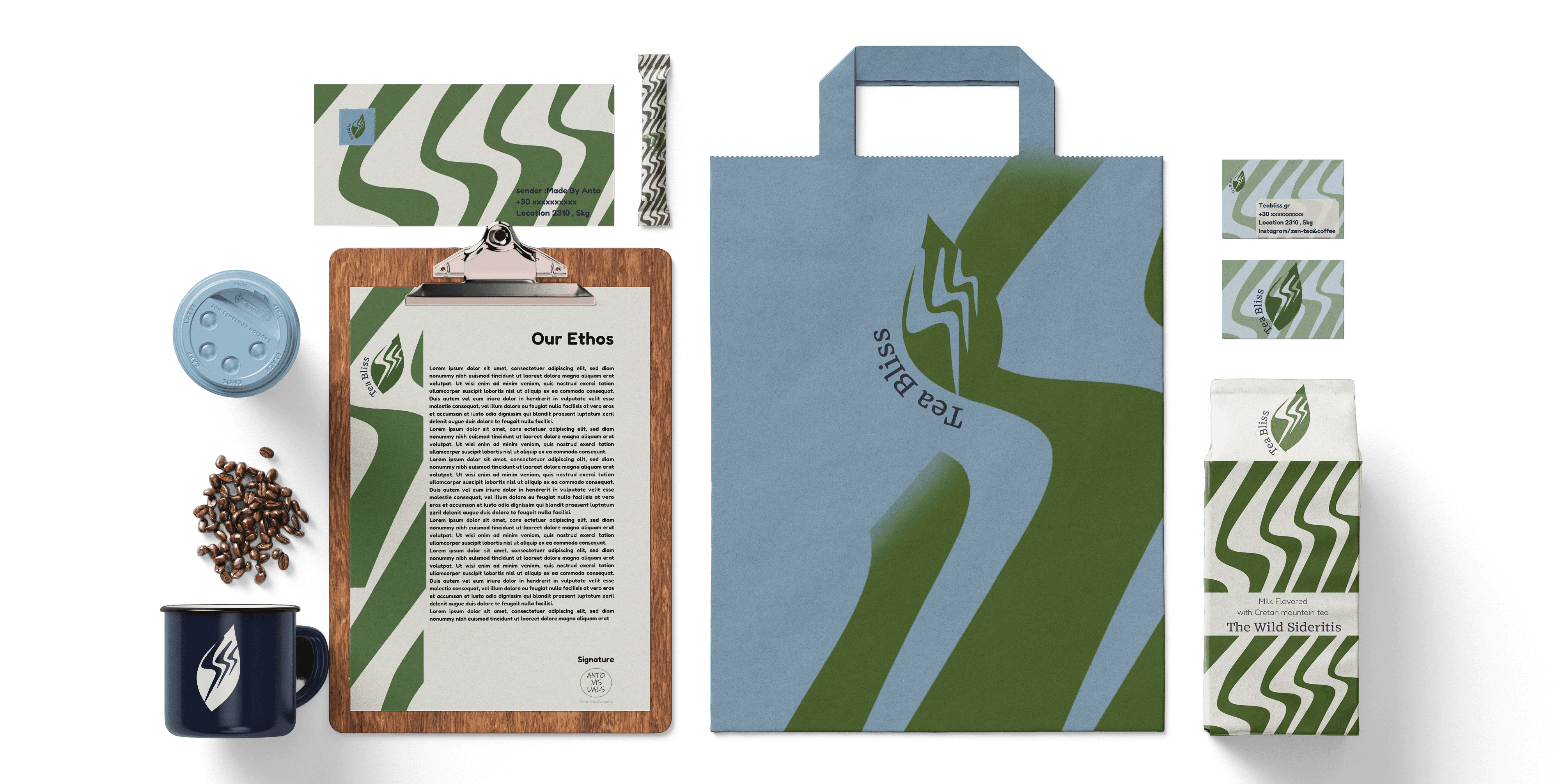
The mark is a tea leaf built from the same line that forms rising steam — one shape reading two ways at once. It sits inside a wordmark set in Corsario, a serif with enough character to carry both the logo and the flavour headlines, paired with Fredoka Light for supporting copy, keeping the system approachable rather than stiff. A secondary wave pattern, echoing the same steam line, ties every application together — from packaging to tote bags — without repeating the logo itself.
Packaging
Packaging had to do two jobs: work as a grab-and-go item at the counter, and hold up as a standalone product on someone else's shelf. Each of the five flavours — Lemon Verbena & Chamomile, Wild Sideritis, Wild Berry & Sage, Masala Chai, and Peppermint & Liquorice — carries its own colour, from forest green to deep oxblood, while keeping the same leaf mark, pattern, and layout. The retail line covers foil pouches and a milk-carton-style box for the Wild Sideritis blend, alongside the in-store cup and cold-cup formats for the ready-to-drink menu.

Typography System
Corsario VF carries the logotype and every flavour name — a serif with enough weight and personality to read as considered rather than generic. Fredoka Light handles taglines and supporting text, keeping the tone approachable next to Corsario's more crafted feel. The pairing is what lets the brand sit somewhere between premium and everyday — serious about the product, not precious about itself.
Outcome
Tea Bliss stayed a concept project rather than a launched product, but it was treated like a full commercial brief from day one — five flavour identities, a complete packaging suite, stationery, and retail signage, all built to hold together as one system. It's one of the pieces I point to when explaining how I think about identity systems that need to flex across many products without losing their core.

Project type
Brand Identity & Packaging
Company name
Tea Bliss
Industry
Food & Drink — Tea shop & retaile

